Grey Goes Flat: Picking Kitchen Colours That Survive a North-Facing Room

Photo: Marufish from Alor Setar, Malaysia, CC BY-SA 2.0, via Wikimedia Commons
There's a particular kind of disappointment that hits about three weeks after the units go in. The door sample that looked so calm and expensive in the showroom — that soft grey, the one everyone on Instagram has — has settled into something closer to dishwater. Nothing is wrong with the paint. What's wrong is the light.
If your kitchen window faces north, you're working with the most consistent and least generous light in the house. It's cool, it's indirect, and in a British winter it can be genuinely dim for a good chunk of the day. This isn't a reason to give up on colour. It's a reason to choose it deliberately.
Why north light changes everything
Northern light is blue-leaning. It bounces in from the sky rather than the sun, so it's softer and more even, but it also drags every colour slightly towards the cool end of the spectrum. Warm greys turn grey-grey. Creams turn slightly green. Pale yellows can look almost sour on a wet Tuesday in February.
There's a second factor nobody mentions at the sample stage: the amount of light actually reaching the surface. A north-facing room might get a fraction of the daylight a south-facing one does, which means colours read darker and flatter than the little chip in your hand. A mid-tone that looks elegant in a bright room can look heavy and muddy when it's covering three metres of cabinetry in a dim one.
The undertone conversation, without the jargon
Most colours are not one colour. A "warm grey" might carry a hint of brown or a hint of yellow; a "cool grey" almost always has blue in it. In a north room, blue undertones get amplified and warm undertones get suppressed. That's why the greige that felt snug in the shop can feel institutional at home.
A rough rule that's served plenty of British kitchens well: in low northern light, lean warm rather than cool, and lean clean rather than muddy. Bone, oatmeal, soft stone and putty tend to hold their character. Blue-greys and mid cool greys are the ones that most often go flat.
Test samples properly — and on a grey day
Small chips are useless. Order an A2 painted board, or better still a spare door front in the actual finish you're buying, and live with it for a fortnight before committing.
Move it around. Prop it against the wall where the tall units will go. Hold it flat where the worktop will be. Look at it at 8am, at noon, and at 4pm in November, then again after dark with the kitchen lights on. The 4pm test and the lights-on test are the two that catch most people out.
And do the grey day test deliberately. A bright, crisp morning flatters everything. The real exam is a drizzly afternoon in January with the heating on and the window slightly steamed up. If the colour still feels right then, you've probably got it.
Finish is half the decision
Two doors in the same shade can behave completely differently. Matt surfaces absorb light and look deeper and denser — great for creating a calm, cocooning feel, less great if the room is already starved of brightness. Satin and low-sheen finishes bounce a little more without the glare. High gloss reflects the window and can lift a dark room considerably, but it also shows every fingerprint and every ripple in the door beneath it.
Texture counts too. A grained wood-effect foil reads warmer than a flat painted slab in the same tone, simply because the surface breaks up the light. In very dark rooms, a subtle grain often does more for atmosphere than a lighter colour does.
Lighting is the third colour in the scheme
You are not choosing a colour. You are choosing a colour plus the light that will fall on it, and the second half is entirely within your control.
A few practical points. Layer the lighting — ceiling, under-cabinet, and something at eye level if you can. Keep your colour temperatures consistent; mixing 2700K warm bulbs with cooler 4000K ones in the same sightline makes even good palettes look accidental. And check the colour rendering on the bulbs you buy, because cheap LEDs can make a well-chosen green look grey and a warm white look faintly clinical. Choose the paint and the bulbs together, not one after the other.
Palettes that tend to work in a north-facing kitchen
- Warm off-whites and bone. Not brilliant white, which reads cold and slightly grey under northern light, and not yellow-cream, which can tip sickly under LEDs.
- Muted greens with a grey or olive base. Sage and soft olive are forgiving in low light and sit well with oak and brass.
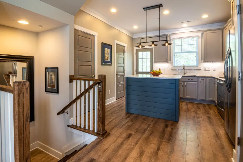
- Deep colours, used with confidence. A north-facing room doesn't have to be painted pale. Ink blue, deep green and even charcoal can look wonderful — rich, quiet and intentional — provided the lighting is layered and the worktop isn't also dark.
- Warm timber. Oak, ash and walnut bring a warmth that no paint can fake, and they hold up in dim rooms better than most cool tones.
- Stone and putty for worktops. A honed, mid-tone surface reads softer than a polished bright white that mirrors a grey sky.
What tends to struggle: large runs of mid cool grey, anything with a strong blue cast on the cabinetry, and high-contrast schemes where a dark door meets a bright white worktop — that contrast can look harsh when the light is already flat.
Keep the palette short
Two or three related tones is plenty: a cabinet colour, a wall that supports rather than competes, and a worktop or splashback that ties them together. Every extra undertone in a low-light room is another thing that can clash once the daylight fades. Carrying the wall colour up over the ceiling, or matching the splashback closely to the door, often does more for a dark kitchen than any single colour choice.
The cheap test that saves an expensive mistake
Paint samples cost a few pounds. A new set of doors costs four figures. Spend an afternoon in the room you're actually renovating, at the times of day you actually use it, with the samples in place. Then trust what you see rather than what the brochure promised.
The best north-facing kitchens aren't the ones that fight the light. They're the ones that were chosen for it.